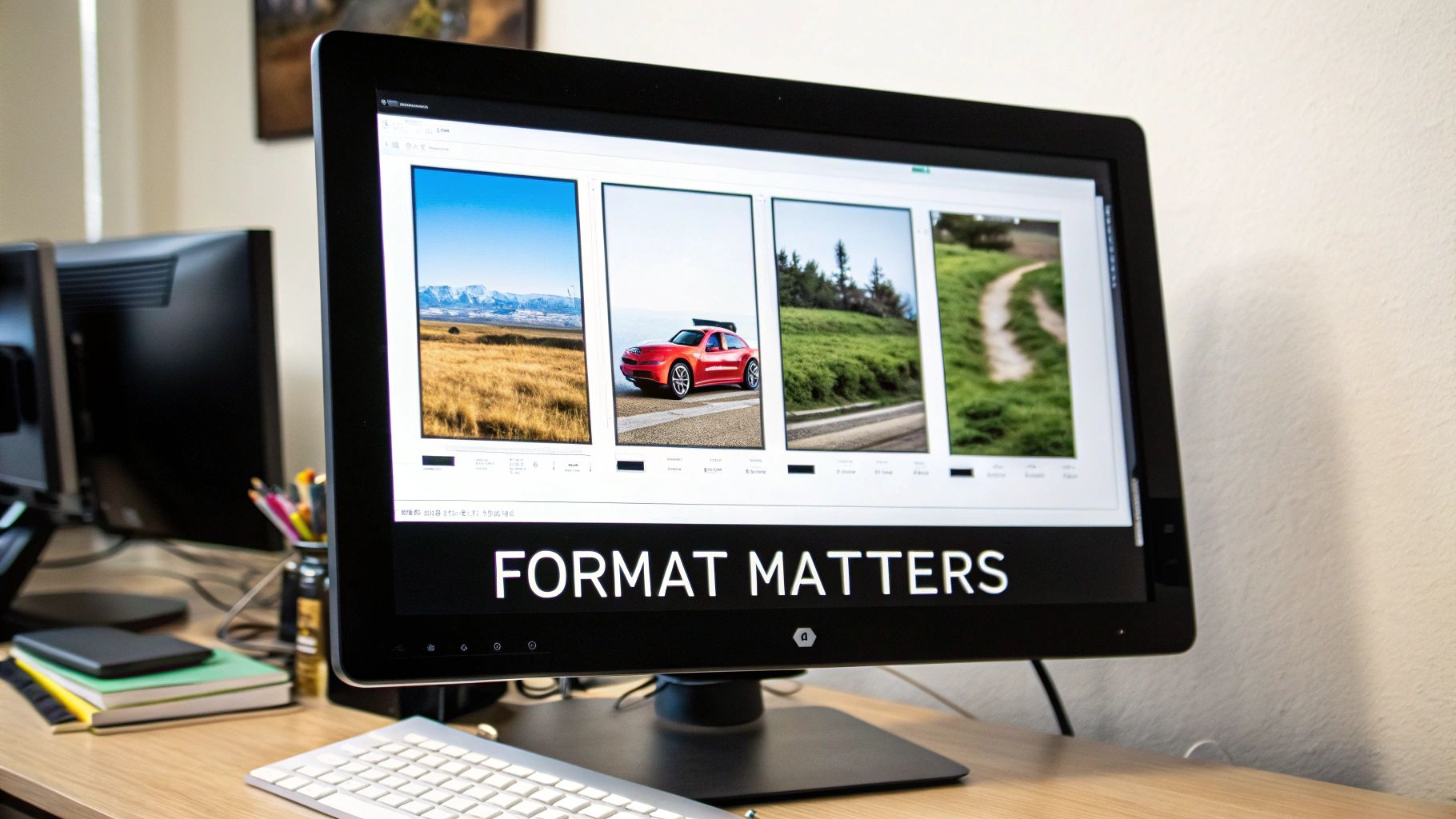
Getting your images ready for the web really comes down to three things: picking the right format (like WebP), compressing the file to shrink its size, and resizing it to the exact dimensions you need. Nail these steps, and you'll see a massive improvement in page speed, user experience, and even your SEO.
Why Image Optimization Is Your Competitive Edge
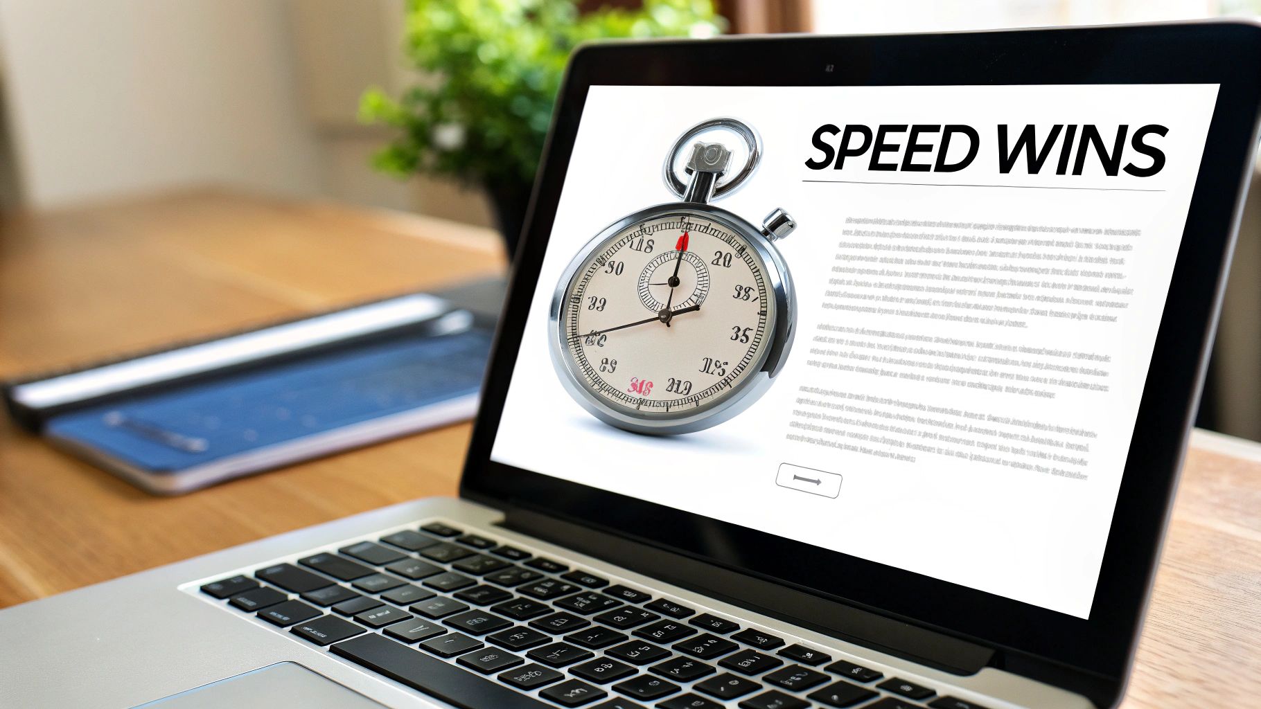
Slow websites are silent killers of success, and nine times out of ten, oversized and unoptimized images are the main culprits. In the battle for user attention, every millisecond is critical. Figuring out how to optimize your images isn't just a technical chore; it's a core business strategy that directly impacts your bottom line.
This is especially true for any site that relies on strong visuals. Whether you're an e-commerce store with product mockups or a professional showing off your new AI-generated headshots, those visuals have to load in the blink of an eye. The whole point is to turn impressive creative work into real business results, and that journey always starts with speed.
The True Cost of a Slow Website
The link between page speed and what your users do is direct and unforgiving. A slow-loading page, dragged down by heavy images, makes a terrible first impression and actively pushes potential customers away. It's also a huge factor in Google's Core Web Vitals, especially the Largest Contentful Paint (LCP) metric, which is just a fancy way of measuring how fast the most important content on your page loads.
Believe it or not, heavy images are responsible for over 60% of the average page delay. The data doesn't lie: pages that load in under one second see 3x higher mobile conversion rates. Even a one-second delay can slash conversions by 7%. This isn't just a small problem; slow websites cost businesses a staggering $2.6 billion in lost sales every single year.
Don't let your beautiful images become a performance liability. A 2MB product photo might look stunning, but if it causes a three-second delay, a huge chunk of your audience will click away before they ever see it.
To put it in perspective, here's how even small delays can have a big impact:
Impact of Load Time on Key Business Metrics
| Load Time Delay | Impact on Conversion Rate | Impact on Bounce Rate |
|---|---|---|
| 1s to 3s | Decreases by 32% | Increases by 32% |
| 1s to 5s | Decreases by 40% | Increases by 90% |
| 1s to 6s | Decreases by 46% | Increases by 106% |
| 1s to 10s | Decreases by 58% | Increases by 123% |
These numbers make it crystal clear: speed isn't just a feature, it's the foundation of a good user experience and a healthy conversion rate. Every second you shave off your load time is a direct investment in your business's success.
From Technical Chore to Business Strategy
If you're just viewing image optimization as a box to check on a technical to-do list, you're missing the big picture. Think of it as a direct investment in your user experience and your entire sales funnel.
Getting this right is a huge step toward gaining a significant Rapid Speed Advantage, turning your site from a slow, frustrating experience into a fast, effective tool for growth. When your images load instantly, visitors stay longer, engage more, and are far more likely to become customers. That's how you turn a simple best practice into a powerful competitive edge.
Choosing the Right Image Format
Before you even touch compression sliders or resizing tools, the single most impactful choice you'll make is the image format. This decision lays the groundwork for everything that follows, dictating just how small your files can get without sacrificing the quality your brand deserves. Nail this, and you've already won a huge part of the battle for a faster website.
The modern web gives us a handful of powerful options. We have the old guards, JPEG and PNG, which still have their place. But the real performance gains come from the next-generation formats, WebP and AVIF. Knowing when to deploy each one is the key to mastering how to optimize images for the web.
The Classic Formats: JPEG and PNG
For years, JPEG and PNG were the undisputed champions of web imagery. They're universally supported, and every designer on the planet knows how they work.
JPEG (Joint Photographic Experts Group) is your workhorse for any kind of complex photograph. Think product shots, hero images with rich gradients, or user-submitted photos. Its lossy compression is brilliant at handling millions of colors, letting you dramatically shrink file sizes for photos with no obvious drop in quality. A detailed 1200px photo might land around 85KB as a high-quality JPEG.
Meanwhile, PNG (Portable Network Graphics) is non-negotiable when you absolutely need transparency. If you're dealing with a logo, an icon, or any graphic with hard edges and solid colors, PNG's lossless compression keeps things perfectly crisp. The trade-off? Size. That same image saved as a PNG could easily balloon to over 500KB. It’s the price you pay for a transparent background.
The Rise of WebP and AVIF
This is where the game really changed. Next-gen formats were built from the ground up for the web, offering compression that the older formats just can't match. You can also check out our AI dating profile photos.
WebP, developed by Google, is the current king of the hill for web optimization. It supports both lossy and lossless compression, handles transparency beautifully, and can even do animations. A WebP image is typically 25-35% smaller than an equivalent JPEG with no visible quality difference. That 85KB JPEG? It becomes a crisp 60KB WebP file, just like that. With over 97% browser support, it’s a safe and incredibly effective default for nearly every image on your site today.
A simple switch from JPEG to WebP across your website can be one of the quickest ways to improve your Largest Contentful Paint (LCP) score and overall page speed. This isn't a minor tweak; it's a major performance upgrade.
AVIF (AV1 Image File Format) is the new kid on the block, and it's even more impressive. It can squeeze out an additional 20-30% in savings compared to WebP, especially for highly detailed images. Our 60KB WebP file could shrink to a tiny 45KB as an AVIF. While its browser support is climbing fast, it's not quite as universal as WebP yet, so you'll want to use it with a fallback.
A Practical Format Selection Guide
So, which one do you choose? It all comes down to what you need. Are you prioritizing photographic detail, sharp lines with transparency, or the absolute smallest file size possible?
Here's a quick reference table I use to make the call.
Image Format Selection Guide
| Format | Best For | Key Feature | Typical File Size |
|---|---|---|---|
| JPEG | Complex photographs, portraits, and images with gradients. | Universal support; great for handling millions of colors. | Good (Baseline) |
| PNG | Logos, icons, and any graphic needing a transparent background. | Lossless quality and full alpha transparency support. | Poor (Very large) |
| WebP | Nearly everything: photos, graphics, transparent images. | Excellent compression with transparency and wide browser support. | Excellent (~30% smaller than JPEG) |
| AVIF | When the absolute smallest file size is the top priority. | The best compression available, especially for high-detail images. | Superior (~50% smaller than JPEG) |
This simple breakdown makes it clear why modern formats are so crucial for performance.
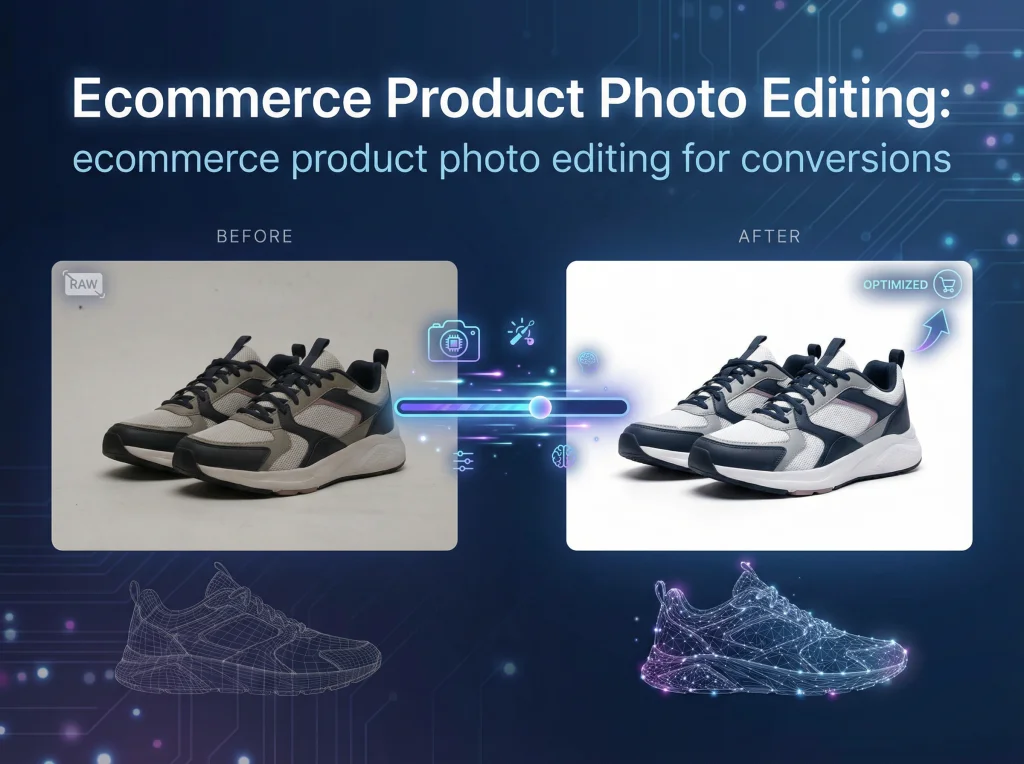
For Photo AI Studio users, the workflow becomes dead simple. After using the background remover to isolate a product for an e-commerce site, exporting as a WebP gives you that critical transparency at a fraction of a PNG's file size. Likewise, once you’ve used the photo upscaler to perfect a headshot, exporting it as a WebP preserves all that stunning detail while ensuring it loads instantly for visitors. You can also check out our AI professional headshots.
Mastering Image Compression and Resizing
Once you've picked the right format, it’s time to tackle compression and resizing. Honestly, this is where the magic happens. These two steps are responsible for the most dramatic drops in file size, turning a bloated, slow-loading image into a lean, web-ready graphic.
Think of it as finding the perfect balance—you want the smallest file possible without anyone noticing a dip in quality. It's a bit of an art, but getting it right means your site will be both beautiful and lightning-fast.
Lossy vs. Lossless Compression Explained
Image compression comes in two main flavors: lossy and lossless. Knowing the difference is crucial for making smart choices.
Lossless compression is like packing a suitcase perfectly. It finds clever ways to organize the image data more efficiently without throwing anything away. When the browser "unpacks" it, every single pixel is identical to the original. This is great for things like logos or detailed diagrams where every pixel counts, but the file size reduction is pretty modest.
Lossy compression, on the other hand, permanently discards bits of data the human eye is least likely to notice. It’s like leaving a few T-shirts you never wear out of your suitcase to make it lighter. The result? Massive file size reductions, often shrinking an image by 70-90%.
For almost all photos on the web, lossy compression is the only way to go. You trade a tiny, imperceptible loss of data for a massive performance gain that your visitors will definitely notice.
The Art of Finding the Sweet Spot
The point of lossy compression isn't to ruin your images; it's to remove data intelligently. Most editing tools, including Photo AI Studio, give you a quality slider, usually from 0 to 100. A setting of 100 means maximum quality (and file size), while 0 is the opposite.
From my experience, the sweet spot is usually between 60 and 85. In this range, you can often slash the file size in half with no visible difference. If you dip below 60, you might start to see ugly artifacts like blockiness or weird color bands. Always, always compare the before and after versions side-by-side to make sure you haven't pushed it too far.
Right-Sizing Your Images is Non-Negotiable
Compression alone isn't enough. You also have to resize your images to the actual dimensions they'll be displayed at on your site. We call this right-sizing, and it's one of the most common and damaging mistakes I see.
Uploading a giant 4000px photo and then using code to shrink it down to a 600px container is a performance disaster. The user’s browser has to download the entire huge file first and then do the work of resizing it. It’s a complete waste of bandwidth and time.
Before you even think about uploading, figure out the largest size that image will ever need to be. For a full-width hero image, that might be 1920px. For a blog post thumbnail, maybe just 800px. Resizing the image to those final dimensions before you compress it is an absolute must.
This is especially true for things like professional headshots on a profile page. You need them to look sharp without slowing down the load time. If you're looking for more on that, our guide on how to prepare for professional headshots and make a great impression has some great tips on presentation.
A Practical Optimization Example
Let’s walk through a real-world scenario to see just how big of a difference this makes. Say you have a gorgeous, high-res product photo for your e-commerce site.
- Original File: Straight from a professional camera.
- Format: JPEG
- Dimensions: 4500px × 3000px
- File Size: 6.2 MB
This file is a boat anchor. It has no business being on a website. Now, let’s optimize it for a product page where the display area is 800px wide.
- Resize: First, we'll resize the image down to 800px × 533px.
- Compress & Convert: Next, we'll save it as a modern WebP file with a quality setting of 75.
- Optimized File: Ready to go live.
- Format: WebP
- Dimensions: 800px × 533px
- File Size: 55 KB
That's a 99% reduction in file size. Mind-blowing, right? The image will now load in a flash, even on a spotty mobile connection, while looking every bit as sharp to your customer. This one simple workflow is one of the most powerful things you can do to speed up your website.
Serving the Right Image Every Time with Responsive Design
Ever landed on a website on your phone and had to wait ages for a giant hero image to load? It’s a classic performance killer. You’re forcing a small device to download a massive desktop-sized file, burning through data and patience, only for it to be shrunk down anyway.
This is exactly the problem modern HTML is built to solve. By using responsive images and lazy loading, you can make sure every user gets an experience tailored to their device. It's about working smarter, not just making files smaller. You hand the reins to the browser, letting it pick the perfect image for any screen and delaying the download of anything that isn't immediately visible. This is also a huge part of making your website mobile friendly and keeping users happy.
Let the Browser Choose the Best Fit with srcset
The magic behind responsive images is the srcset attribute. Instead of just giving the browser a single src file, you give it a whole menu of options and trust it to order the right one. You’re essentially saying, "Hey browser, here are a few versions of this image at different sizes. You know the user's screen and network better than I do, so pick the one that makes the most sense."
This is a complete game-changer. It shifts the decision from your code to the user's device, which has all the context it needs to make an intelligent choice.
The browser knows the device's screen density (think Retina displays), the exact size of the viewport, and even how fast the internet connection is. Using
srcsetallows it to pick the perfect file, something a one-size-fits-allsrccould never do.
Let's walk through a real-world example. Say you have a key image for a blog post that needs to look sharp on everything from a tiny phone to a massive monitor. Your first step is to create a few different sizes of that image.
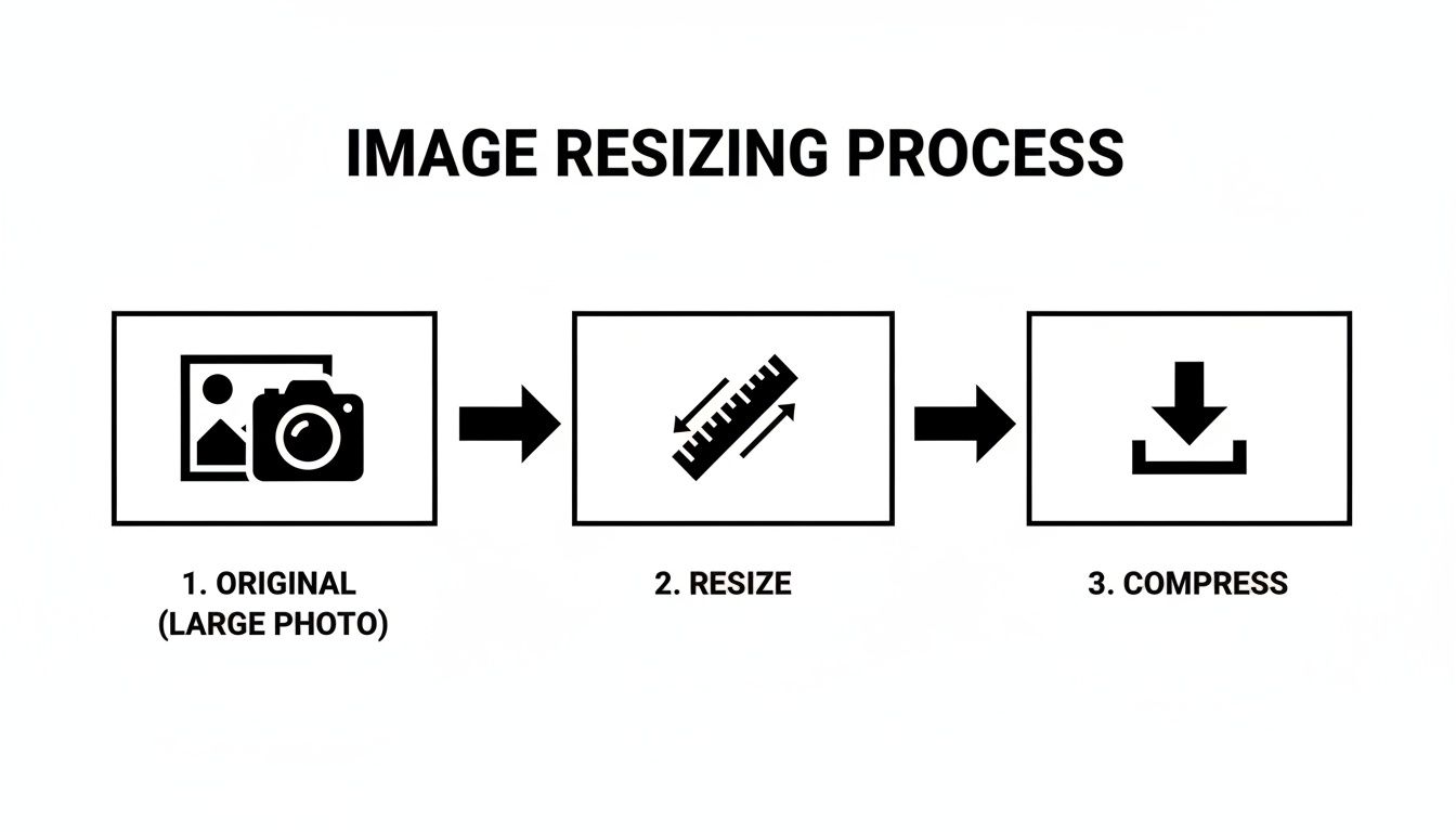
The process is straightforward: start with your high-quality original, resize it to the dimensions you need, and then compress it for the web. This is the core workflow you should be using for all your image assets.
Instead of just slapping the biggest version in your HTML, you'd use something like this:

So what’s going on here?
srcset: This attribute lists all the available image files and their actual widths. For instance,photo-small.webp 480wtells the browser that this specific file is 480 pixels wide.sizes: This gives the browser a crucial hint—how big the image will actually appear on the screen. The line(max-width: 600px) 480pxtranslates to "if the screen is 600px wide or less, this image is going to take up 480px of space."
The browser takes both pieces of information and downloads the smallest possible file that will still look crisp in the designated space. The tiny phone gets the 480w file, the desktop gets the beautiful 1200w version, and everyone gets a faster experience.
For anyone creating perfectly-sized visuals for social media campaigns, we dive deeper into this in our guide on Instagram-themed AI photography.
Load Images Only When Needed with Lazy Loading
The other half of this performance puzzle is lazy loading. Think about it: why should a user have to download all 20 product images on a long category page when they can only see the first two? Lazy loading fixes this by telling the browser to hold off on downloading images until they're about to scroll into view.
This has a huge, immediate impact on your initial page load time and critical metrics like First Contentful Paint (FCP). The browser can focus its energy on rendering the content the user sees right away, making the whole page feel significantly faster.
And the best part? It's ridiculously easy to implement.
All you need is a single attribute:

That’s it. The loading="lazy" attribute is now a native browser feature. It’s a simple instruction to only fetch the image right before it's needed. This is one of the most effective optimizations you can make on image-heavy pages, like galleries, blogs, or e-commerce sites. In fact, modern frameworks like Next.js—which we built Photo AI Studio on—often do this for you right out of the box, but it’s an essential tool for any developer's belt.
Automating Your Optimization Workflow
Manually resizing, compressing, and converting every single image is a surefire path to wasted hours and inconsistent results. It’s one thing to understand the fundamentals of image optimization, but the real win is making it an invisible, seamless part of your process. This is where automation comes in, turning a repetitive chore into a 'set it and forget it' system that does the hard work for you.
Working smarter, not harder, means building a scalable, high-performance pipeline where image optimization just happens. Whether you're a developer using a modern framework or a content creator on a platform like Shopify, there are incredible tools that can handle the heavy lifting.
Leveraging Build-Time Optimization
If you're working with a modern web framework like Next.js (which is what we use to build Photo AI Studio), you’re already sitting on a goldmine of automation. These frameworks are built from the ground up with performance in mind and often include powerful, built-in image components that handle optimization at "build time"—the moment your site gets compiled and deployed.
This process is wildly efficient. When you add an image, the framework can automatically:
- Generate
srcsetAttributes: It creates multiple resized versions of your image for different screen sizes without you lifting a finger. - Convert to WebP: It serves up next-gen formats like WebP to capable browsers by default, with automatic fallbacks for those that can't handle it.
- Implement Lazy Loading: Images are automatically set to
loading="lazy", which is a massive win for initial page speed.
For a developer, this is often as simple as swapping a standard <img> tag for the framework's dedicated <Image> component. The framework handles the rest, ensuring every single image is served in the most efficient way possible, every time.
By baking optimization directly into the development process, you completely eliminate the risk of human error. No one can forget to compress a hero image or generate a WebP version, because the system does it automatically.
This is the peak of efficiency for web image optimization, creating a foolproof system that guarantees high performance.
Using Image CDNs for On-the-Fly Transformations
But what if you aren't using a framework with built-in tools? This is where an Image CDN (Content Delivery Network) becomes your best friend. Services like Cloudinary, Imgix, or Akamai's Image & Video Manager are designed specifically for this job.
Here’s the brilliant part: you upload a single, high-resolution master image to the CDN. Then, instead of linking directly to that file, you use a special URL that tells the CDN how to transform the image on the fly.
This approach gives you unbelievable flexibility. You can resize, crop, change formats, and adjust quality just by tweaking a few parameters in the image URL itself.
A Real-World Example
Let's say you have a master product photo: master-product.jpg. With an Image CDN, you could generate different versions instantly:
- A 400px wide, 75% quality WebP for a product grid:
.../w_400,q_75/master-product.webp - An 800px wide, auto-quality AVIF for a product detail page:
.../w_800,q_auto/master-product.avif - A 100px square thumbnail with automatic face-detection cropping:
.../w_100,h_100,c_thumb,g_face/master-product.webp
This method completely separates your original asset from how it's presented, giving you total control without ever opening an image editor. It's an automated, dynamic way to serve the perfect image for any context.
For e-commerce stores on platforms like Shopify or WordPress, countless plugins and apps integrate directly with these CDNs. You can install an app, connect your account, and it will automatically rewrite your image URLs to serve them through the CDN, delivering an instant performance boost across your entire site. This is a game-changing strategy for automating your entire optimization workflow.
Making Your Images Work for Everyone (and Google, Too)
A perfectly optimized image isn't just about speed. If it's invisible to users with visual impairments or hidden from search engines, it's not doing its job. Think of it like this: you've built a high-performance engine, but without accessibility and SEO, you've forgotten the steering wheel and the GPS. You might be fast, but you're not going anywhere useful.
Nailing this final piece of the puzzle is surprisingly straightforward. It really boils down to two things: writing helpful alternative text (alt text) and using descriptive, human-friendly file names. These simple habits transform a basic image file into a powerful asset that makes your site more inclusive and boosts your search rankings.
Writing Alt Text That Actually Helps
Let's get one thing straight: alt text is an accessibility feature first and an SEO tool second. Its primary job is to be read aloud by screen readers, giving visually impaired users a clear understanding of an image they can't see. It’s a cornerstone of building a web that works for everybody.
Of course, it also gives search engines like Google a massive clue. Crawlers can't see your photo of a new product, but they can read the alt text. This helps them understand what the image is about, which is crucial for ranking in Google Images and reinforcing your page's overall topic.
A great alt text description is:
- Specific and Descriptive: Don't just write
alt="dog". Go foralt="Golden retriever puppy playing with a red ball in a grassy park". - Contextual: The description should fit naturally with the text around it.
- Concise: Aim for clarity, not a novel. Most screen readers trail off after about 125 characters, so get to the point.
- Honest (No Spam!): Never, ever stuff it with keywords like
alt="blue shoes buy shoes cheap shoes online". This is a fast track to getting penalized.
Think of alt text as a direct message to both screen readers and search engine bots. You're trying to paint an accurate picture with words, making your visuals understood by anyone and anything.
Why Your Image File Names Matter
Long before you even upload an image, you have a golden opportunity to send a clear signal to search engines: the file name. A generic name like IMG_8021.jpeg tells a crawler absolutely nothing. It’s a completely wasted bit of SEO real estate.
Get into the habit of renaming your files to be descriptive and clear. It’s a small step that pays off big time. Use hyphens to separate words—it's the standard crawlers understand best. This simple action helps them categorize your image correctly before their bots even start reading your page.
Just look at the difference it makes:
| Bad File Name | Good File Name |
|---|---|
DSC_0045.webp |
professional-ai-headshot-in-suit.webp |
product-2.jpg |
blue-suede-running-shoes.jpg |
bg-final-v2.png |
modern-kitchen-with-marble-island.png |
When you combine lightning-fast formats and loading strategies with thoughtful alt text and strategic file names, you've solved the entire image optimization puzzle. Your visuals will be high-performing, accessible to all, and perfectly positioned to be discovered.
Answering Your Image Optimization Questions
Diving into image optimization can feel like a rabbit hole of technical terms and conflicting advice. Let's clear things up. Here are some quick, no-nonsense answers to the questions I hear most often from developers and designers trying to build faster websites.
What Is the Ideal File Size for a Web Image?
There’s no magic number here—it’s all about context. A massive hero image will naturally be larger than a small blog thumbnail.
But if you need a rule of thumb, here’s what I stick to: aim for under 200KB for those big, beautiful hero images, and keep your smaller, in-content images well under 100KB. The real goal isn't hitting a specific number, but rather compressing the file as much as possible without anyone noticing a drop in quality. Always, always check the final image on a decent screen before you push it live.
Should I Use WebP for All My Images Now?
For the most part, yes. It's time.
With over 97% of browsers now supporting it, WebP is no longer a futuristic format; it’s the modern standard. It consistently delivers smaller files than JPEG or PNG at comparable quality, making it a fantastic default choice.
If you’re worried about that last 3% of users on ancient browsers, the <picture> element is your best friend. It lets you serve the super-optimized WebP version to modern browsers while providing a trusty JPEG or PNG as a backup. It's a win-win.
Shifting your default format to WebP is one of the quickest, highest-impact changes you can make. It's a modern standard for a reason—it delivers smaller files with great quality, directly improving your site's performance.
How Does Image Optimization Affect My SEO Ranking?
It affects it more than you might think, and in a few key ways. First and foremost, speed. Smaller images mean faster page loads. Faster pages lead to better Core Web Vitals, which Google has explicitly confirmed is a ranking factor. A slow, heavy site will absolutely get dinged in search results.
Beyond speed, optimization gives search engines crucial context. Smart use of descriptive alt text and keyword-rich file names (like blue-suede-running-shoes.webp instead of IMG_8432.jpeg) tells Google exactly what your image is about. This helps your page rank for its topic and gives your images a shot at ranking in Google Image Search, which can be a surprisingly powerful source of traffic.
Ready to create stunning, perfectly optimized visuals in seconds? Photo AI Studio gives you the tools to generate professional headshots, edit product photos with an AI-powered background remover, and export in web-ready formats. Start creating with Photo AI Studio today!