Improving your ecommerce conversion rate is all about turning more of your hard-won visitors into actual customers. It’s not just about pumping more money into ads; it's about plugging the leaks in your sales funnel, from lackluster product photos to a clunky checkout, so you can make more money from the traffic you already have.
Diagnosing Your Store's Conversion Health
Before you start messing with button colors or rewriting headlines, you need to know what you’re trying to fix. Diving into A/B testing without a proper diagnosis is like trying to navigate a new city without a map—you’ll be busy, but you probably won’t get anywhere useful.
The first step is a hard, data-driven look at your store’s performance to see exactly where you're losing people. This isn’t about chasing vanity metrics like site visits. It's about finding the real bottlenecks where potential buyers are dropping off.
Your analytics dashboard—whether it’s Google Analytics, Shopify's built-in tools, or something else—is your command center. Your mission is to trace the customer journey and pinpoint the moments people give up. Are they bouncing from product pages? Is the cart abandonment rate through the roof? The answers to these questions will guide every move you make.
Setting Realistic Benchmarks
Once you have your numbers, you need some context. Is a 1.5% conversion rate a total disaster or just a starting point for a new store? This is where industry benchmarks are incredibly helpful.
The global average for ecommerce conversion rates tends to hover in the 2.5-3% range. Knowing this gives you a realistic target and highlights the massive opportunity most stores have to improve.
The average across all industries is around 1.89%, but the real story is in the device breakdown. Desktop shoppers convert at a much higher rate (3.9%) compared to mobile users (1.8%). That gap tells you right away that the mobile experience is a huge lever for growth.
Take a look at this chart. It lays out the conversion rate differences pretty clearly.
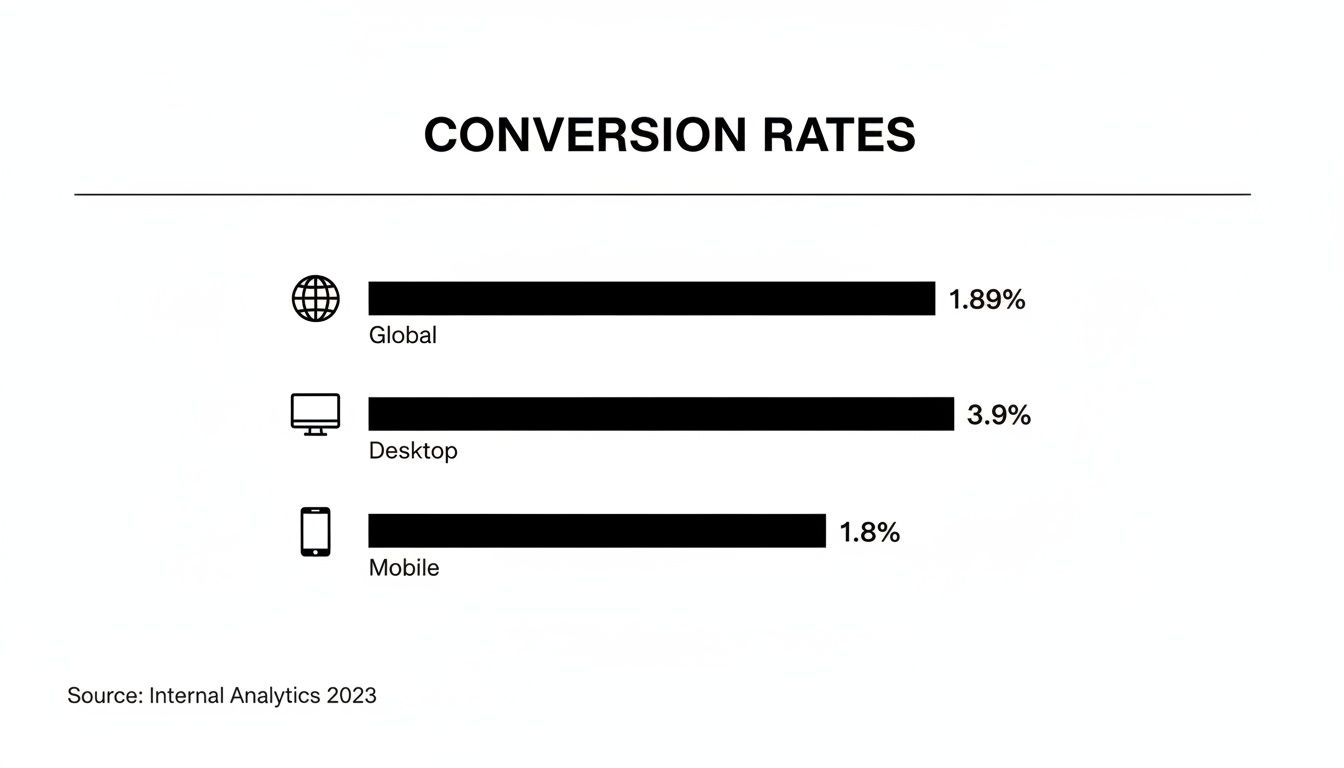
The data doesn't lie: desktop users are more than twice as likely to complete a purchase. If your mobile experience isn’t seamless, you’re leaving a ton of money on the table.
Here's a quick look at some key stats to help you see where your store stands.
Ecommerce Conversion Rate Benchmarks
A summary of key conversion rate statistics to help you benchmark your store's performance across different devices and see where you stand.
| Metric | Average Rate | Source Insight |
|---|---|---|
| Global Ecommerce Average | 1.89% | The all-industry baseline for online stores. |
| Desktop Conversion Rate | 3.9% | Desktop users remain the highest-converting segment. |
| Mobile Conversion Rate | 1.8% | Highlights the major opportunity in mobile optimization. |
These numbers provide a solid starting point for evaluating your own analytics and setting some initial goals.
Identifying Early Warning Signs
Sometimes, the clues to a low conversion rate aren't buried in a spreadsheet. They’re hiding in plain sight on your website.
Think about it from a shopper's perspective. Blurry, outdated, or low-quality product photos are an immediate red flag. They kill trust and don’t give customers the confidence they need to click “buy.” Your analytics tell you what is happening, but a critical look at your on-page experience will often tell you why.
For a deep dive into all the levers you can pull, these expert tips to improve ecommerce conversion rates are a great resource. This diagnostic phase is the foundation for everything that comes next, so don't skip it.
Turning Product Pages into Conversion Powerhouses
Think of your product page as your digital sales floor. It’s that critical moment when a window shopper becomes a serious buyer. Every single element on that page either pushes them toward the “Add to Cart” button or sends them packing. If you want to see your conversion rates climb, you have to start by making these pages ridiculously persuasive.
The real job of a product page? To answer every question a customer has, often before they even know they have it. They can’t touch, feel, or try on your product, so your visuals have to do all the heavy lifting. This is where so many online stores drop the ball.
A single, sterile product shot on a white background just doesn't cut it anymore. Today's shoppers expect to see your product from every possible angle, in crisp detail, and—most importantly—in a real-world context that lets them picture it in their own lives.
Answering Questions with Powerful Visuals
Your image gallery should function like a visual FAQ. Each photo needs to tackle a potential doubt or show off a key benefit. Can they zoom in to see the texture of the fabric? Is there a shot showing how big the product is next to something familiar, like a phone or a coffee mug?
Here’s how you build a visual story that actually sells:
- High-Resolution Imagery: Let people zoom in and inspect the details without the image turning into a blurry mess. This instantly builds trust in your product’s quality.
- 360-Degree Views: For items like furniture, sneakers, or electronics, a 360-degree view is a game-changer for understanding the product's actual shape and dimensions.
- In-Use Lifestyle Shots: Show your product being used by real people in believable settings. A camping tent looks a lot more compelling pitched under the stars than it does sitting in a sterile photo studio.
- Authentic Video Content: A quick video showing the product in action can be incredibly powerful. It's the closest you can get to an in-person demo.
For anyone serious about taking their visuals to the next level, exploring specialized e-commerce video production can unlock a whole new way of presenting products. Video closes the gap between simply seeing an item and truly understanding how it works and feels.
Here's a number that always gets my attention: research from Northwestern University found that just showing customer reviews can boost conversion rates by as much as 270%. Powerful visuals work the same way—they offer tangible proof and build the confidence someone needs to click "buy."
This is exactly where AI tools are shaking things up. With a platform like PhotoAI Studio, you can generate a nearly infinite variety of professional lifestyle shots without the insane cost and logistics of a traditional photoshoot. You can place your product in any scene you can dream up, creating targeted visuals for all your different customer segments.
Go Beyond Features to Benefits-Driven Copy
Once your visuals grab their attention, your product description has to close the deal. The single biggest mistake I see is a dry, boring list of features and specs. Sure, that information is necessary, but it doesn't sell.
Your copy needs to translate those features into real-world benefits. Don't just say "water-resistant coating." Say "Keeps your gear bone-dry through surprise downpours." You’re not selling a technical feature; you're selling the feeling of relief and confidence.
Make your copy easy to scan. Use short paragraphs, bullet points, and bold text to make the most compelling benefits pop off the page. A visitor should be able to understand your product's core value in a matter of seconds.
The Rise of Virtual Try-On Experiences
For industries like fashion, beauty, and even home goods, the inability to "try before you buy" has always been a massive barrier to conversion. This is where technology like virtual try-on is having a huge impact.
Imagine a customer being able to see how a pair of sunglasses actually looks on their face, or how a new armchair would fit in their living room, all through their phone's camera. This kind of tech strips away a huge layer of doubt and hesitation from the buying journey.
Tools like PhotoAI Studio's Clothes Try-On feature are making this accessible to more brands. It lets shoppers see what products look like on them, which dramatically cuts down on purchase anxiety and, down the line, return rates. By giving customers this level of confidence, you're directly solving one of the biggest pain points in online shopping and making the path to purchase that much smoother.
Building Unshakable Trust with Your Customers

In the digital world, trust isn't just a nice-to-have; it's the currency that powers every single sale. When a visitor lands on your site, they’re asking one simple, subconscious question: "Can I trust this store with my money?"
If the answer is anything less than a resounding "yes," they're gone. They won't think twice.
Boosting your conversion rate often boils down to answering that question with confidence at every touchpoint. It’s about strategically embedding trust signals throughout your website, turning a skeptical browser into a confident buyer. These signals work together to slash perceived risk and make the decision to purchase feel both safe and smart.
And the most powerful form of trust? It comes from other customers.
The Power of Authentic Social Proof
We’re wired to follow the crowd. When a potential customer sees that others have bought from you—and loved the experience—their own confidence in your brand skyrockets. Social proof is one of the fastest ways to build immediate credibility.
Here's how to weave it into the fabric of your site:
- Customer Reviews and Ratings: This is the absolute bedrock of e-commerce trust. Make sure star ratings are bright and visible on both category and product pages.
- Written Testimonials: A glowing quote from a happy customer, complete with their name and maybe a photo, adds a human element that a simple star rating can't touch.
- User-Generated Content (UGC): Encourage customers to share photos or videos of themselves with your products. Featuring this content shows your product in the wild and proves you have a thriving community of real buyers.
Getting customers to leave reviews can feel like pulling teeth, but a simple, well-timed email after their purchase can work wonders. A small incentive, like a discount on their next order, is a great way to thank them for their time. You can see how other customers are talking about their experiences by checking out the PhotoAI Studio reviews for some inspiration on how to display feedback.
More Than Just Reviews: Building a Foundation of Trust
While social proof is a heavy hitter, it's only one piece of the puzzle. A truly trustworthy site projects security and professionalism from top to bottom. If any part of the experience feels amateurish or unsafe, you risk undoing all the hard work your great reviews have done.
Think about the other signals that calm a nervous shopper's mind. Transparent policies, visible security seals, and a clear sense of who is behind the brand all contribute to a feeling of safety.
A study by the Baymard Institute found that 19% of shoppers abandon their carts because they don't trust the site with their credit card information. This isn't a small leak; it's a gaping hole. Visible trust signals at checkout are non-negotiable.
Don't let easily fixable trust gaps sabotage your sales.
Key Elements for a Trustworthy Store
To make sure your entire site inspires confidence, run a quick audit for these critical trust-building elements. Each one tackles a common customer fear head-on.
1. Crystal-Clear Policies
Vague or hidden policies on shipping, returns, and privacy are massive red flags. Make this information dead simple to find from your footer on every single page. Use plain language, not legalese. A fair and clear return policy, in particular, can be the final nudge a hesitant buyer needs.
2. Visible Security Badges
Display familiar logos like SSL certificates (that little padlock icon) and payment provider badges (Visa, Mastercard, PayPal) where it matters most: during checkout. These visual cues instantly tell shoppers that their financial data is locked down and protected.
3. An Authentic 'About Us' Story
People connect with people, not faceless websites. Your 'About Us' page is a golden opportunity to share your mission, introduce your team, and build a real connection. A genuine story makes your brand more memorable and helps you stand out from the crowd.
4. Accessible Customer Support
Make it painfully easy for customers to get help. A visible contact email, phone number, or live chat widget is essential. Just knowing that a real human is a click away provides a powerful sense of security, especially for first-time buyers who might have a few questions before they’re ready to buy.
Streamlining Checkout to Reduce Cart Abandonment

You’ve done all the hard work. Your product photos are perfect, the copy is convincing, and you’ve peppered the site with trust signals. The customer loves what they see. They add it to their cart, ready to pull the trigger. And then… crickets. They’re gone.
This isn’t some rare fluke; it’s the default story in ecommerce. Cart abandonment rates are hovering above 70%. This turns the final step of a sale into the most brutal part of the funnel. The game isn't just about getting people to your store anymore; it's about making sure they don't trip on their way out the door. For a deeper dive, check out the data on global conversion rates by industry and device.
A clunky, confusing checkout is the silent killer of conversions. Think of it as the digital version of a ridiculously long line at a physical store—most people will just give up. Plugging this leak is one of the fastest ways to see a real lift in your conversion rate.
Eliminate Unnecessary Friction Immediately
Let's cut to the chase: the single biggest source of friction is forced account creation. A customer is literally trying to give you their money. The absolute last thing you should do is throw a mandatory registration form in their face. It’s an easy mistake to make, and it’s responsible for a shocking number of abandoned carts.
The fix is just as simple: offer guest checkout. Let them buy the thing. All you need is the info to ship it and charge them. You can always ask them to create an account on the "Thank You" page after the sale is locked in.
Here are a few other common friction points to hunt down and destroy:
- Too Many Form Fields: Do you really need their phone number for a non-perishable item? Every extra box they have to fill out is another tiny reason to leave. Stick to the absolute essentials.
- Limited Payment Options: Not everyone lives in a Visa world. Adding digital wallets like Apple Pay, Google Pay, and PayPal can cut checkout time down to seconds, especially for mobile shoppers.
- A Distracting Layout: Your checkout page should be a clean, straight line to the finish. Get rid of the main navigation menu, pop-ups, and any other shiny objects that could lure them away from completing the purchase.
Your checkout process should feel like an express lane, not a DMV line. The goal is to get the customer from "I want this" to "It's on its way" as quickly and smoothly as possible. Any step that doesn't directly serve that goal should be cut.
Create Transparency and Build Confidence
The second biggest reason people bail? Unexpected costs. A customer is perfectly happy with a $50 product total, but when they get hit with a surprise $15 for shipping and taxes on the final screen, it feels like a bait-and-switch.
Be upfront about all costs, as early as possible. Show shipping estimates right on the product page or in the cart. A shipping calculator or a simple banner that says "Free shipping on orders over $75" manages expectations and kills that last-second sticker shock. This kind of transparency is vital for keeping the trust you've worked so hard to build. You can see great examples of clear pricing structures by looking at different PhotoAI Studio pricing plans.
Another way to boost confidence is to show them where they are in the process.
Guiding Users Through the Final Steps
A multi-step checkout is fine—sometimes necessary—but it should never feel like an endless maze. This is where a visual progress bar works wonders. It’s a simple tool that lowers anxiety by showing people the light at the end of the tunnel.
Example Progress Bar:Shipping > Payment > Review > Complete
This small visual cue tells shoppers exactly where they are, how much is left, and that the finish line is in sight. It makes the whole process feel structured and manageable.
Finally, you absolutely must ensure your checkout is flawless on mobile. More than half of all e-commerce traffic is now mobile, yet so many checkout forms are still a nightmare on a small screen. Buttons need to be big enough to tap, form fields should trigger the right keyboard (like the number pad for a credit card), and the layout should be simple and vertical. A bad mobile checkout isn't just an inconvenience; it's a hole in your pocket.
Using AI to Create High-Impact Visuals at Scale
The battle for conversion is often won or lost on your visuals. Customers can't touch, feel, or try on your products through a screen, so your product photography has to do all the heavy lifting. It needs to build desire, show off the quality, and answer questions before they're even asked.
But let's be honest: the traditional photoshoot is a massive bottleneck. It’s slow, wildly expensive, and leaves you with a finite set of images. That’s a huge problem in a world that demands fresh content for every channel, every day.
This is where AI is completely rewriting the rulebook. Forget renting studios, hiring models, and spending days on set. You can now generate an entire library of conversion-optimized visuals right from your laptop. This isn't just about saving a few bucks; it's about gaining the agility to create specific visuals for every marketing idea, customer segment, and product variation you can dream up.
Tools like PhotoAI Studio are putting this capability into the hands of brands of all sizes, making it a cornerstone of modern strategies for improving ecommerce conversion rates.
From Studio Shoots to AI-Powered Creation
The old way of creating visuals is painfully rigid. You spend weeks planning a shoot, drop thousands of dollars for a single day's work, and you walk away with what you walk away with. Need to show that jacket in a different setting? Or on a model with a different look? That means starting the whole expensive process all over again.
AI completely flips this model on its head.
All you need are a few simple photos of your product. By training an AI on those images, you can instantly generate a nearly infinite variety of scenes. This means you can create highly specific, relevant visuals at a moment's notice, without any of the traditional overhead.
AI-driven content generation lets ecommerce brands test visual hypotheses at a speed that was unimaginable a few years ago. You can create ten different lifestyle shots for a single product, run them in your ads, and know which one converts best by tomorrow—a cycle that used to take months and a small fortune.
This ability to create and test on the fly is a massive competitive advantage. You're no longer guessing which visuals will resonate with your audience; you're using real data to find out.
Generating Diverse and Contextual Lifestyle Imagery
One of the surest ways to connect with a customer is to help them picture your product in their life. They need to see it in a relatable context. This is where AI becomes an absolute powerhouse for creating compelling lifestyle images.
With a tool like PhotoAI Studio, you can generate shots that show:
- Your new skincare line artfully arranged on a sun-drenched marble countertop.
- Your rugged hiking boots covered in mud on a mountaintop trail at sunrise.
- Your innovative kitchen gadget in action within a cozy, modern family kitchen.
You can spin up hundreds of these scenes, tailoring them to specific audiences. Imagine creating one set of images targeting urban professionals and another set targeting outdoor adventurers—all for the same product, all in a single afternoon. This kind of visual personalization was simply out of reach for most brands until now.
This same tech can even give your team's image a boost. You can check out a free professional headshot generator to see how AI can instantly transform simple portraits into polished, business-ready photos.
The Rise of AI-Generated UGC and Video
Authenticity sells. We all know that user-generated content (UGC) is pure gold because it feels real, unbiased, and trustworthy. But what if you're a new brand? You can't just wait around for customers to start creating that content for you.
Here again, AI provides an incredible solution.
Advanced platforms can now create incredibly realistic, UGC-style videos that showcase your product. Think AI-generated models unboxing your item, demonstrating its key features, or giving a testimonial-style review. It looks and feels just like the content people see in their social feeds every day.
This lets you build a library of authentic-looking social proof that you can deploy in ads and on your product pages, building that crucial credibility right from day one. It helps bridge the trust gap that almost every new store faces.
Reducing Hesitation with Virtual Try-On
For industries like fashion, eyewear, and cosmetics, the biggest conversion killer is one simple question: "But how will this look on me?"
AI-powered virtual try-on technology finally gives customers a direct answer.
By letting shoppers upload a photo to see how that dress, those sunglasses, or that shade of lipstick looks on their own face, you eliminate the single biggest point of friction in their buying journey. You're turning an abstract product on a screen into a tangible, personalized experience.
The impact goes beyond just boosting that initial conversion, too. By giving shoppers a much more accurate preview of fit and appearance, virtual try-on technology has been proven to significantly reduce return rates. That protects your bottom line long after the sale is made, closing the loop and turning visual engagement into confident, lasting purchases.
Got Questions About Boosting Your Conversion Rate?

Even with a solid game plan, diving into conversion rate optimization can feel like trying to solve a puzzle. You’re juggling data, design, and a whole lot of customer psychology, and it's natural for questions to pop up.
Getting straightforward answers to the usual sticking points can help you focus your energy where it'll actually move the needle. Let's tackle some of the most common questions I hear from store owners.
What Is a Good Ecommerce Conversion Rate, Really?
This is the big one, and the honest answer is: it depends. Everyone wants a magic number, but the reality is that conversion rates swing wildly based on industry, traffic source, and price point.
If you're looking for a general benchmark, aiming for a conversion rate between 2% and 3% is a solid goal for most ecommerce stores. The top players often push past 3%, but obsessing over industry averages can be a distraction. The most important number is your own.
Here's what shapes that number:
- Where are they coming from? Someone clicking from a targeted email you sent is far more likely to buy than a casual browser from a broad social media ad.
- What are you selling? High-end furniture will naturally have a lower conversion rate (but a much higher order value) than a popular $20 t-shirt.
- Which device are they using? As we've covered, desktop users still tend to convert at nearly double the rate of mobile users. Your traffic mix matters.
The real win isn't hitting some arbitrary number. It’s about consistently improving your own baseline. A jump from 1.2% to 1.8% is a massive success that directly impacts your bottom line.
How Can I Get a Quick Conversion Lift on My Product Pages?
If you need a fast win, look no further than your product visuals. Your images and videos are your digital salespeople, and most stores aren't making them work hard enough.
Start by ditching single, flat product shots. You need high-quality photos from every conceivable angle, plus lifestyle shots that show your product in a real-world context. Even a short, punchy video demonstrating the product in use can give you a significant bump by showing, not just telling.
Another quick fix? Your "Add to Cart" button. Make it bold. Use clear, action-oriented text. Ensure it visually pops off the page so there’s no question what to do next. A simple tweak to its color or size can make a surprising difference.
How Do I Know My Changes Are Working if I Can't A/B Test?
While A/B testing is the gold standard for CRO, it’s not always feasible, especially for smaller stores or more subtle changes. Don't worry—you can still get a great read on your impact by tracking key metrics before and after you roll out an update. You can also check out our AI Instagram photos.
Set a clear "before" and "after" period—say, two weeks each side of the change—and keep a close eye on these numbers:. Check out our AI professional headshots.
- Bounce Rate: Are fewer people leaving the page right away?
- Time on Page: Are they sticking around longer to engage with your new content?
- Add-to-Cart Rate: Is that main CTA getting more clicks?
- Checkout Completion Rate: Of the people who add to cart, are more of them actually finishing the purchase?
You can also get a ton of insight from tools like Hotjar that offer heatmaps and session recordings. These let you literally watch how users interact with your new design, giving you the "why" behind the numbers. Sometimes, that qualitative feedback is even more valuable than a formal split test.
Ready to create stunning visuals that actually convert? With Photo AI Studio, you can generate a massive library of professional product shots, lifestyle images, and even authentic-looking UGC-style videos without the crazy costs of a traditional photoshoot. Stop letting mediocre images hold you back. Explore what Photo AI Studio can do for your store and start turning more browsers into buyers today.